


How to Read an ETF Factsheet: The Numbers That Matter
Two ETFs on the exact same index can quietly diverge by thousands over a working life. The factsheet tells you which one is silently eroding your returns. Few investors open it.
Cite this article
Freedom Isn't Free (2026) How to Read an ETF Factsheet: The Numbers That Matter. Available at: https://freedomisntfree.co.uk/articles/how-to-read-an-etf-factsheet (Accessed: 5 July 2026).
Italicise the article title in your bibliography. Accessed date set to today.
TLDR
- Check the Ongoing Charge Figure (OCF) to understand the annual fees for the fund, with lower percentages being more favourable.
- Look at the Tracking Difference to see how closely the fund follows its benchmark, with a neutral difference being ideal.
- Review the Tracking Error to gauge the consistency of the fund's performance relative to its benchmark, with lower values indicating better consistency.
- Analyse the Beta to determine the fund's volatility in relation to the market, with a value close to 1.0 indicating standard market behaviour.
- Examine the Alpha to understand the fund's ability to outperform its benchmark after adjusting for market exposure, with close-to-zero values being typical for passive index funds.
ETF factsheet numbers - what counts as good
| Metric | Good for passive | Watch out |
|---|---|---|
| OCF | Under 0.25% | Above 0.50% rarely justified |
| Tracking error | Under 0.10% annually | Above 0.5% = drift |
| Beta | Close to 1.0 | Outside 0.95-1.05 |
| Sharpe ratio | Above 1.0 | Beware short windows |
| Dividend yield | 1% to 4% normal | 7%+ usually a warning |
For a plain global equity tracker. Sector or tilted ETFs read differently.
How to Read an ETF Factsheet: The Numbers That Matter
Every ETF comes with a factsheet - a one or two-page summary published by the fund provider. For most passive investors, it goes unread. That is a mistake. The factsheet contains the numbers that determine whether two apparently identical funds are actually the same, and whether the one you hold is quietly eroding your returns.
This article explains the main statistics you will encounter, what they mean, and what counts as good or bad.
A quick note on terminology. The "factsheet" is the marketing summary. Alongside it sits the Key Investor Information Document (KIID) - a regulator-mandated two-page disclosure in a standardised format. If you only have time for one, the KIID is the higher-trust source because the format is fixed by law.
Contents
- Ongoing Charge Figure (OCF)
- Tracking Difference and Tracking Error
- Beta
- Alpha
- Sharpe Ratio
- Standard Deviation
- Price-to-Earnings Ratio (P/E)
- Dividend Yield
- Past Performance
- Historic Distributions
- Putting It Together
- Author's Take
- Frequently Asked Questions
Ongoing Charge Figure (OCF)
The OCF - sometimes called the Total Expense Ratio (TER) - is the annual cost of owning the fund, expressed as a percentage. A 0.20% OCF means you pay £20 per year on a £10,000 holding. It covers management, administration, and custody, but not trading costs or stamp duty when the fund rebalances.
What is good? Under 0.10% is competitive for an S&P 500 or MSCI World tracker. FTSE All-World ETFs run 0.15% to 0.25%. Above 0.50% for a passive fund is hard to justify. At 7% gross over 30 years, a 0.07% OCF versus 0.50% on £10,000 produces a difference of over £10,000 in final value.
Tracking Difference and Tracking Error
These two are often confused.
Tracking difference is the gap between the fund's actual annual return and the return of the index it tracks. If the S&P 500 returned 10.0% and your ETF returned 9.85%, the tracking difference is −0.15%. A negative tracking difference (fund lagging index) is normal and expected - the OCF accounts for most of it. Some ETFs actually beat their index through securities lending income, producing a positive tracking difference.
Tracking error is the volatility of that gap over time - how consistently the fund tracks its index. A fund with a low tracking error replicates the index reliably day to day, even if there is a persistent small gap. A high tracking error suggests the fund is drifting - potentially due to sampling methods, cash drag, or poor replication.
What is good? For a physically replicated index ETF, tracking error below 0.10% annually is excellent. Tracking difference close to or better than zero is ideal.
Beta
Beta measures how much the fund moves relative to its benchmark. A beta of 1.0 moves in lockstep; 1.2 amplifies market moves by 20% in both directions; 0.8 is 20% less volatile.
For a plain index ETF, beta should be very close to 1.0. A significant deviation suggests the fund is not tracking as expected, or is using leverage. For sector-tilted ETFs (a clean energy fund might run above 1.5), higher potential return comes with amplified drawdowns.
Alpha
Alpha measures return in excess of what beta alone would predict - value added (or destroyed) after adjusting for market exposure.
For a passive index ETF, expect alpha close to zero. Consistently positive alpha in a passive fund is usually explained by securities lending income or favourable dividend tax treatment, not skill. Where alpha matters is comparing active funds: a consistently negative alpha after fees is the clearest signal that an active manager is destroying value.
Sharpe Ratio
The Sharpe ratio measures risk-adjusted return: how much excess return you receive per unit of volatility taken.
Sharpe ratio = (fund return − risk-free rate) ÷ standard deviation of returns
Higher is better. Above 1.0 is good; above 2.0 is exceptional. It is most useful when comparing two funds with similar objectives. Be cautious of Sharpe ratios over short periods: a fund that ran during a bull market will look excellent. Always check the time period.
Standard Deviation (Volatility)
Standard deviation quantifies how much the fund's returns vary. Higher means wilder swings in both directions.
For context, the S&P 500 has historically had an annualised standard deviation of around 15-17%. A broad global equity ETF sits in a similar range; a bond ETF might be 4-7%; a sector or leveraged product can exceed 30%. Volatility is the price of long-term equity returns - understanding it helps you hold your nerve during drawdowns.
Price-to-Earnings Ratio (P/E)
Some factsheets include a weighted-average P/E ratio for the underlying holdings - a snapshot of how expensive the basket is relative to current earnings.
A useful pair of anchors: above 30 is expensive territory, below 15 is relatively cheap. Most cap-weighted global trackers sit between. A value-tilted ETF runs a noticeably lower P/E because it excludes the most expensive growth names.
P/E is not a buy or sell signal on its own - a high P/E can be justified by future growth, a low P/E can mask structural decline - but it is a useful sanity check on whether holdings have been bid up to price in a lot of optimism. For more, see our P/E ratio guide.
Dividend Yield
The dividend yield is the trailing twelve months of distributions divided by the current share price. It tells you what income you would receive on every £100 invested, assuming the next year looks like the last.
Yield acts as a soft floor on how far the price can fall in a speculative bubble: if a fund is yielding 5% and the price halves while intrinsic value barely moves, the yield effectively jumps to 10% - a level that pulls value investors back in. Yield-paying companies also tend to fluctuate less because the cash flow anchors the price each quarter. Lower beta is partly a yield story.
You do not normally see headline yields above 5% unless something exceptional is going on: a one-time windfall, a structurally high-yield vehicle like a BDC, or a UK REIT where tax rules force at least 90% distribution. A 7% yield on a vanilla equity fund is more often a warning sign than an opportunity.
Past Performance
Every factsheet shows past performance and disclaims it - "past performance is no indication of future returns." The caveat exists because investors chase last year's winner into next year's underperformer. But refusing to look at past performance at all is also wrong. A track record across multiple market regimes (a bull, a bear, a sideways grind) tells you something the marketing copy will not. History does not repeat itself but rhymes is closer to the practical truth.
Watch out for the pattern where someone walks you through a five-year chart and then quotes the disclaimer as cover. The line is there for legal reasons.
Historic Distributions
For distributing ETFs, look beyond the headline yield to the distribution history - the actual payouts over the past five to ten years. (If you are unsure which share class you hold, see accumulation vs income ETFs.) A steadily growing line is one of the better litmus tests of underlying intrinsic value: the cash flow is genuinely there and the fund is passing it through. A flat or declining history says the opposite regardless of how appealing the current yield looks. A spike followed by a fall back to baseline signals a one-off windfall.
This matters most for dividend or value investors. For a cap-weighted growth tracker, distribution trend is a sideshow - total return is the only number worth tracking.
Replication Method
Every ETF declares how it tracks its index. The three options are physical (buys the underlying securities), sampled or optimised (owns a representative subset), and synthetic (holds unrelated assets and uses a swap with a bank to deliver the index's return).
Physical or sampled is the default and right choice for most UK investors. Synthetic introduces counterparty risk - if the bank on the swap fails, the fund is exposed. UCITS rules cap that exposure at 10% per counterparty, but it is still a risk physical does not have. Synthetic can make sense for specific tax-treaty advantages or hard-to-access markets, but know which you are buying. For the funds most UK investors end up holding, see our list of popular UCITS ETFs.
The factsheet also shows the number of holdings, top ten, and sector/geographic breakdown. Cross-check these against the index. A "global" fund with 80% in US large-cap tech is technically correct under cap-weighting but might not be the diversification you thought you were buying.
Fund Size, Domicile, and Inception Date
Three pieces of housekeeping data are worth a glance.
Fund size (AUM) is the total assets under management. Larger funds (£500m+) tend to have tighter spreads and lower closure risk. A £20m ETF is more likely to be wound down, forcing a taxable event for holders.
Domicile is where the fund is legally registered. Most UK-investable UCITS ETFs are domiciled in Ireland. Irish domicile is preferred for US equity exposure thanks to the US-Ireland tax treaty (15% withholding on dividends vs 30% for many other domiciles).
Inception date tells you how long the fund has existed. A track record across at least one full market cycle is more informative than three years of one-way returns. ETFs launched in 2020 have only ever existed in one regime.
Putting It Together: What to Check Before Buying
When evaluating any ETF, run through this sequence:
- OCF - is it competitive for this asset class?
- Tracking difference - does the fund faithfully replicate its index?
- Beta - is it what you expect for this strategy?
- Sharpe ratio - compared to peers over the same period, is risk being rewarded?
- Standard deviation - does the volatility fit your time horizon and temperament?
- P/E ratio - is the underlying basket priced reasonably for current earnings?
- Dividend yield - what income does it produce, and is the yield in normal territory?
- Past performance - what has the fund done across at least one full market cycle?
- Distribution history - if it pays out, are the distributions growing over time?
Two ETFs tracking the same index can differ meaningfully on all of the above. The factsheet is where those differences live.
For a broader look at how to choose between funds once you understand the numbers, see how to choose a low-cost index fund.
Practise on a real factsheet
To apply this end-to-end, try the Vanguard FTSE All-World High Dividend Yield UCITS ETF (VHYL) overview - a UCITS-compliant ETF holding 2,339 stocks.
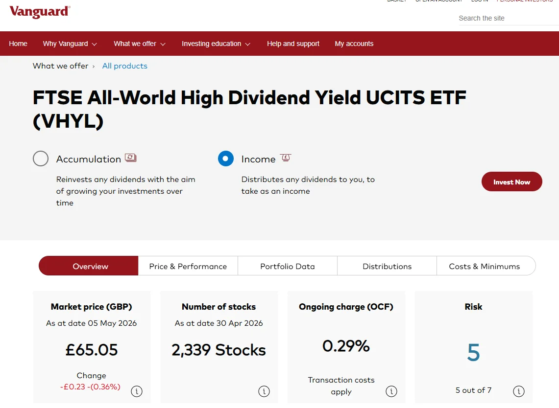 The VHYL overview exposes the four headline numbers: market price, number of holdings, OCF, and risk score.
Compare it against a cap-weighted global tracker like VWRP and the trade-offs become concrete: lower P/E, higher dividend yield, lower beta, less mega-cap tech concentration, in exchange for a higher OCF and a narrower universe. The factsheet is where the case is made. For where to actually hold it, see the best UK investment platform.
Frequently Asked Questions
What is the most important number on an ETF factsheet?
For a passive index fund, the OCF is the starting point. But tracking difference is often more revealing - it shows whether additional costs beyond the headline OCF are creating a larger gap to the index.
What should beta be for a simple index ETF?
Very close to 1.0. For a standard global equity tracker, beta outside 0.95 to 1.05 warrants investigation - it suggests leverage, synthetic replication with unexpected exposure, or tracking issues.
Is a high Sharpe ratio always good?
Generally yes, but be cautious about short measurement periods. A fund that ran through an extended bull market shows an inflated Sharpe that does not reflect performance over a full cycle. Always check the period covered.
Do ETF factsheet numbers change over time?
Yes. OCFs are updated periodically as providers reprice. Tracking difference and error shift with market conditions. Always check the factsheet date and look for the most recent version on the provider's website.
Read Next
- Popular UCITS ETFs UK investors actually hold
- Accumulation vs income ETFs in the UK
- The best UK investment platform compared
- How to choose a low-cost index fund
- P/E ratio explained
Further Reading:
The Little Book of Common Sense Investing - John Bogle - The clearest argument for why OCF and tracking difference are the two factsheet numbers that compound into real money over decades. (Affiliate link - we may earn a small commission at no extra cost to you.)
Smarter Investing - Tim Hale - A UK-focused guide to evidence-based investing that walks through how to compare funds using exactly the metrics on a factsheet. (Affiliate link - we may earn a small commission at no extra cost to you.)
Enjoying the content?
If this site has been useful, a coffee goes a long way.
Browse more articles
Browse all