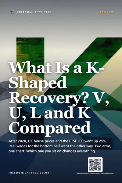


What Is a K-Shaped Recovery? V, U, L and K Compared
After 2020, UK house prices and the FTSE 100 went up 25%. Real wages for the bottom half went the other way. Two arms, one chart. Which one you sit on changes everything.
Cite this article
Freedom Isn't Free (2026) What Is a K-Shaped Recovery? V, U, L and K Compared. Available at: https://freedomisntfree.co.uk/articles/what-is-a-k-shaped-recovery (Accessed: 24 June 2026).
Italicise the article title in your bibliography. Accessed date set to today.
TLDR
- A K-shaped recovery is one where different parts of the economy diverge sharply after a downturn: some sectors and households recover quickly, others keep falling. The two arms of the K go in opposite directions.
- Compare with V (sharp drop, fast bounce), U (drop, slow recovery), L (drop, no recovery), and W (drop, bounce, second drop).
- The 2020-2024 post-pandemic UK recovery is the textbook K-shaped example: asset owners and high earners were back to peak in months while low-paid sectors, renters and younger workers got materially worse off.
- K-shaped recoveries make headline GDP misleading because the average can rise even as the bottom half of the distribution declines.
What Is a K-Shaped Recovery? V, U, L and K Compared
A K-shaped recovery is an economic recovery in which different parts of the economy diverge sharply after a downturn: some sectors and households bounce back quickly to new highs, while others keep falling for years. Plotted on a chart, the two paths look like the arms of the letter K: one rising, one falling. The post-pandemic UK between 2020 and 2024 is the textbook example, with the FTSE 100 and house prices up roughly 25% while real wages stagnated.
Economists have long described recoveries by the letter their growth chart resembles, and the alphabet has been quietly stretched to keep up with how complicated modern recoveries actually are. V, U, L and W are the older shapes. K is the most recent, and probably the most important for understanding what has happened to the UK economy since 2020.
Contents
- The recovery alphabet, briefly
- V-shaped recovery
- U-shaped recovery
- L-shaped recovery
- W-shaped recovery
- K-shaped recovery: the divergence
- The post-pandemic UK as a K
- Why this matters for personal finance
- Frequently Asked Questions
The recovery alphabet, briefly
The recovery shape is just the visual pattern of GDP, employment or asset prices on a chart from a downturn through to its eventual stabilisation. The letters are shorthand for that pattern:
| Shape | Pattern | Typical example |
|---|---|---|
| V | Down sharp, up sharp | 2020 stock market crash and rebound |
| U | Down sharp, flat, then up | 1990-1991 UK recession |
| L | Down sharp, flat indefinitely | Japan after 1990 |
| W | Down, bounce, second drop, recovery | 1980-1982 US "double-dip" |
| K | Down, then split into two divergent paths | UK post-2020 (assets up, wages flat) |
The shape only really emerges after the fact. While you are inside a recovery, no one knows which letter it will turn out to be. That ambiguity is partly what makes economic forecasting so unreliable.
V-shaped recovery
A V-shaped recovery is the best-case scenario: a sharp downturn followed by a sharp rebound, with the economy back to its previous trajectory within months rather than years.
Examples often cited:
- The 1953 US recession (driven by the end of Korean War spending), followed by a fast rebound.
- The early 2020 stock market crash and rebound. The S&P 500 fell 34% in 33 days then fully recovered within five months. Equity markets traced an almost perfect V.
V-shaped recoveries depend on the underlying cause being short-lived (a one-off shock rather than a structural problem) and on policy support (interest rate cuts, fiscal stimulus) being deployed fast and decisively.
U-shaped recovery
A U-shaped recovery has the same starting and ending points as a V, but spends meaningful time at the bottom before climbing out. The flat base might last a year or more.
The classic example is the 1990-1991 US and UK recession. Output dropped, then stayed depressed through 1991 and most of 1992 before recovery took hold. The UK economy did not return to its pre-recession peak until late 1993.
U-shaped recoveries usually involve damage that takes time to repair: bank balance sheets, household savings, business investment. The economy needs time to rebuild capacity before it can grow again.
L-shaped recovery
An L-shaped recovery is the worst case: a downturn followed by no meaningful recovery at all, just a long flat plateau at a lower level. The economy never returns to its previous trajectory.
Japan after 1990 is the textbook L. The Nikkei peaked at around 39,000 in December 1989 and did not recover that level until 2024, 34 years later. Wages, property prices, and broader output stagnated for an entire generation. The "lost decades" of Japan are an extreme case study in what happens when an asset price bubble pops in a country with structural demographic and policy problems.
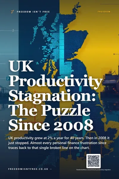
The 2008 financial crisis recovery in the UK was arguably L-shaped for productivity, even if GDP eventually recovered. UK productivity per hour worked has barely grown since 2008, breaking a long-standing pattern of around 2% annual gains. Whether that flatness counts as an "L" depends on what you are measuring and whether you think it is permanent.
W-shaped recovery
A W-shaped or "double-dip" recovery is when the economy starts to recover, falters into a second downturn, then eventually genuinely recovers. The chart looks like two Vs side by side.
The 1980-1982 US recession is the standard example. The Federal Reserve under Paul Volcker raised interest rates aggressively to break inflation, the economy went into recession, started to recover, then the further rate hikes triggered a second downturn before the eventual rebound.
W-shapes are particularly painful because the false bounce in the middle creates premature optimism, which is then crushed.
K-shaped recovery: the divergence
A K-shaped recovery is structurally different from all of the above. The other letters are about timing: how fast does the average recover? K is about distribution: who recovers and who does not.
In a K-shape, after a downturn:
- The top arm rises. Asset prices, high-end wages, large businesses, technology sectors, and home-owning households recover or even reach new highs.
- The bottom arm falls or stagnates. Low-paid workers, renters, small businesses in affected sectors, and certain regions or demographic groups continue to struggle long after the headline economy has stabilised.
The average can look fine in a K. Headline GDP, employment or median income figures may show recovery while the underlying distribution widens dramatically. That is what makes the K shape so easy to miss: it is invisible if you only look at aggregates.
The mechanism behind a K usually involves three things working together:
- Asset prices recover faster than wages. Central bank stimulus (quantitative easing, low interest rates) pushes up the price of stocks and houses, which benefits those who already own them.
- The downturn hits different sectors unevenly. A pandemic that closes hospitality but not finance creates a built-in K from day one.
- Government support is uneven. Furlough schemes help employees more than self-employed contractors. Bank rescues protect financial sector employment more than retail or hospitality.
The post-pandemic UK as a K
The UK's post-2020 recovery is the textbook K. The data is stark:
- FTSE 100 rose around 25% from January 2020 to early 2024.
- UK average house prices (Nationwide HPI) rose around 25% from early 2020 to late 2022.
- Real wages were broadly flat or down for most workers from 2020 to 2024 once you account for inflation, according to ONS average weekly earnings data. The 2022-2023 cost-of-living crisis hit lower-income households hardest because food, energy and rent inflation ran well above headline CPI.
- Asset-owning households (homeowners with equity, investors with ISA portfolios, those with secure final-salary pensions) saw their balance sheets reach record highs. This is much of the story behind why boomers had it easier than younger cohorts in the same period.
- Renting households, younger workers, people in hospitality and retail, and disabled workers saw stagnant or falling real income with rising costs.
The headline GDP figures over the same period showed a recovery to around pre-pandemic levels by mid-2022. The headline figures missed the divergence almost completely.
Post-2020 UK divergence, indexed to Jan 2020 = 100
Source: FTSE 100 close, Nationwide House Price Index, ONS average weekly earnings (real terms)
This is the K in action. Two parallel UK economies coexist: one where assets and high incomes are doing well, one where wages, rent and essentials are eating people alive. Headline reporting tends to focus on the top arm because asset prices, FTSE moves and the housing market are easier to measure and more newsworthy.
Why this matters for personal finance
The K-shape is not just a macroeconomic curiosity. It has direct implications for how you think about your own financial position.
Owning assets is increasingly the key to which arm of the K you sit on. This is not new (it has been the trajectory of most developed economies since the 1980s), but post-pandemic recoveries have accelerated the divergence. Wage labour alone, even at decent salaries, now struggles to keep up with asset price inflation in housing and equities.
This is part of why building asset wealth through small monthly investing matters even on a modest income. The structural argument behind FIRE, behind index investing, behind early pension contributions: get yourself onto the upper arm of the K, however small your starting position, before you spend the next 40 years on the lower arm wondering why life keeps getting more expensive.
The honest version is that not everyone can do this. People who genuinely have nothing to spare after essentials cannot invest their way out of structural disadvantage, and saying otherwise is offensive. But for everyone with even £10-£50 a month spare, deploying that into broad-market assets early is the most reliable individual lever available against the K-shaped structural pull of the modern economy. If you want a sense of how far that compounds over a working life, the compound interest calculator shows what even modest monthly contributions become over 20-40 years.
Frequently Asked Questions
What does K-shaped recovery mean in simple terms?
After an economic downturn, some parts of the economy bounce back fast (or even hit new highs) while others stay flat or get worse. The shape of the divergence looks like the two arms of the letter K. Asset owners and high earners typically end up on the top arm. Low-paid workers, renters and certain sectors end up on the bottom arm.
What is the difference between V, U, L and K recoveries?
V is fast down, fast up. U is fast down, slow up. L is fast down, no real up. K is fast down then a split: parts of the economy go up, others keep going down. The first three describe how fast the economy recovers on average. K describes how unevenly the recovery is distributed.
Was the post-pandemic UK recovery K-shaped?
Yes, on most measures. UK house prices and the FTSE 100 reached record highs by 2022-2024, while real wages stagnated and lower-income households were hit hard by the 2022-2023 cost-of-living crisis. Headline GDP figures showed recovery, but the underlying distribution widened dramatically.
Who benefits from a K-shaped recovery?
People who already own substantial assets at the start of the recovery: homeowners with equity, investors with diversified portfolios, employees with stock-based compensation, and workers in sectors that benefit from low interest rates (technology, finance, professional services). The mechanism is that asset prices recover faster than wages.
How can individuals protect themselves from K-shaped dynamics?
Owning broad-market assets early is the structural answer: index funds inside an ISA, pension contributions, and any other route to participating in asset price growth rather than relying purely on wages. None of this is a substitute for policy action on inequality, but at the individual level, it is the lever most people have available.
Read Next
- Why Boomers Had It Easier: The Numbers Behind the Frustration - the generational version of the K-shape, with the specific numbers on housing, pensions and wages.
- FIRE UK vs US: Why Financial Independence Is Harder in Britain - the structural disadvantages that compound the K for UK savers.
- Inflation-Protected Investing UK: How to Beat Stealth Erosion - the inflation side of the cost-of-living crisis that drove the lower arm of the post-pandemic K.
- Is It Worth Investing Small Amounts Monthly? - the practical case for getting onto the asset-owning side of the divergence even on a modest income.
Further Reading:
The Psychology of Money - Morgan Housel - Housel's chapters on luck, inequality and the role of starting position help explain why two people in the same economy can end up on opposite arms of the K. (Affiliate link - we may earn a small commission at no extra cost to you.)
The Little Book of Common Sense Investing - John Bogle - the most direct route onto the upper arm of the K for an ordinary saver: own the whole market through low-cost index funds and let asset prices do the work. (Affiliate link - we may earn a small commission at no extra cost to you.)
Enjoying the content?
If this site has been useful, a coffee goes a long way.
Browse more articles
Browse all